Yahoo! I'm working on bringing another one of my titles back to the market as a digital publication! This time it's Happy, Sad, Good, Bad. I'm excited about bringing all of my books back, but this story, in particular, because of the theme. This story talks about feelings. We all have them so we will all be able to relate.
The story follows Caitlin, a young girl, who shares her feelings and why she has each of them. She's a very cool, relatable character and I absolutely love her voice. You will see feelings addressed from sadness, to happiness, to agitation. All in all the story covers eight different feelings and she, Caitlin, carries you through all of the scenarios that crystalizes those feelings.
Also, I love the fact that Caitlin records all of the happenings in a journal. Hopefully the character's postings will encourage children to begin to use journals to record their feelings and/or whatever they want to document. Caitlin also includes a page of reflection for each feeling which is quite cool.
I am so very excited to reintroduce Happy, Sad, Good, Bad in this form, and I hope that readers walk away with lessons from the story.
As I mentioned earlier, in my blog post about The Sad Snowman, my illustrations are one of the reasons why I removed my books from the market. Take a look at a few before-and-afters for Happy, Sad, Good, Bad.
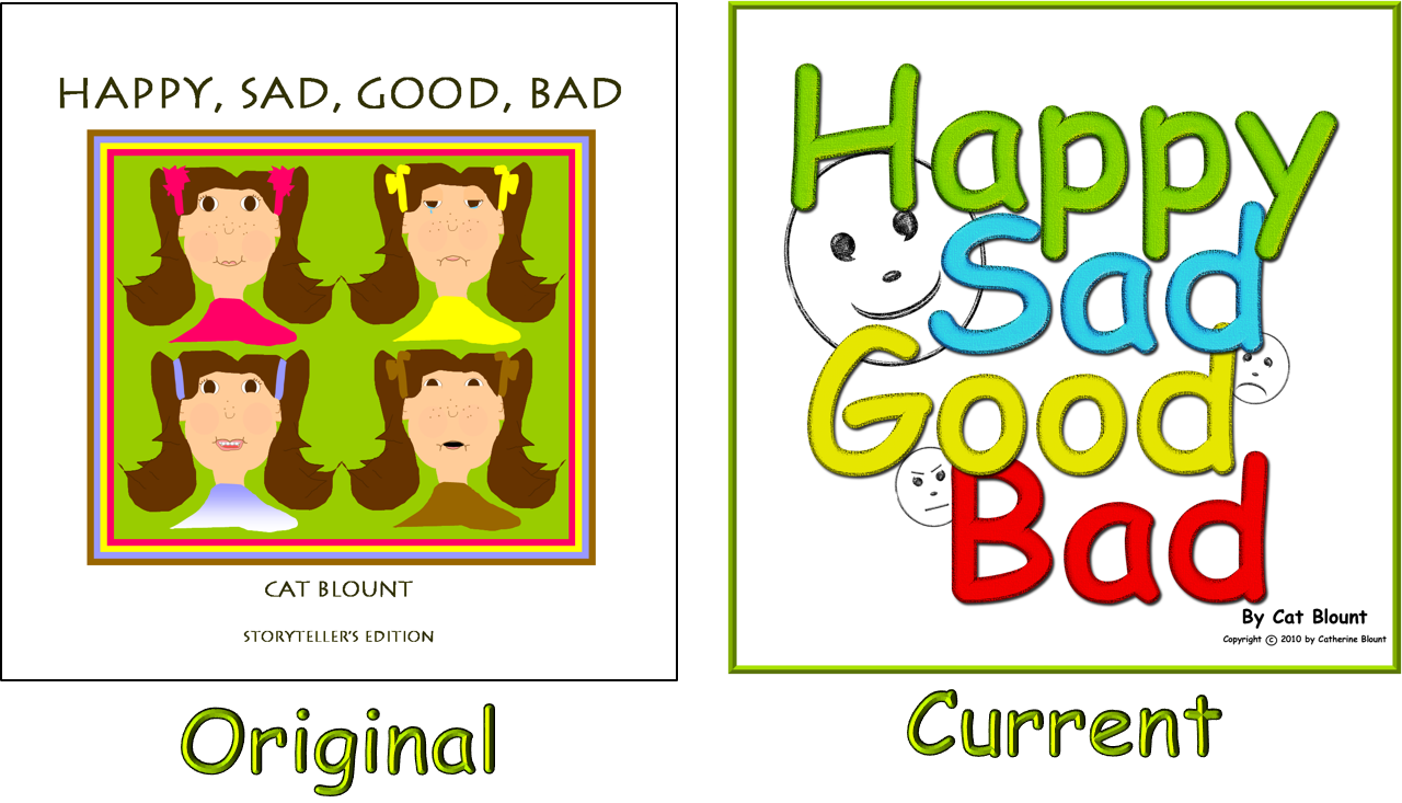
Here are the covers, original and current. I personally LOVE the new cover. I really do. My husband HATES it, and at first, the faces, to my oldest daughter, looked scary, LOL. I have to say, my husband is starting to warm up to the new covers as the faces are stamps that Caitlin places on her journal pages throughout the story. "Well at least I see some relevance…" Too funny.
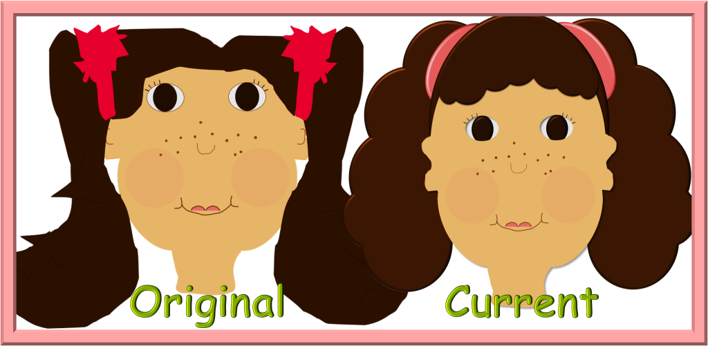
Next are illustrations of Caitlin, the main character. I think you will agree with me that the current is so much better. Right? My children, especially Caitlin, my daughter, at first, was not liking the change, at all. They warmed up to the "new look" after a while. Not much of a difference, I know, but still I think the current illustration is better.
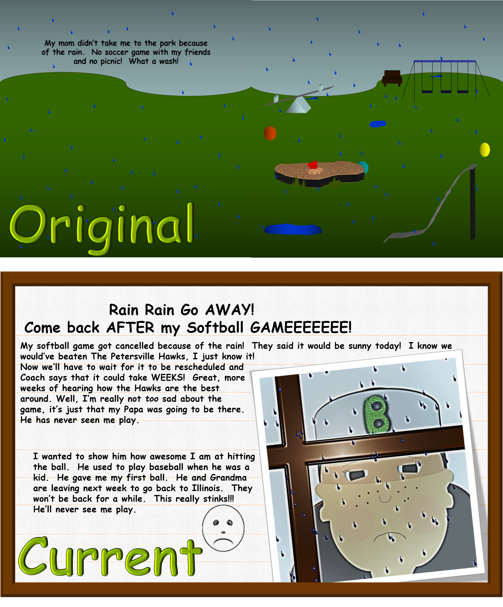
I'm almost too ashamed to show this one. This example not only touches upon the illustrations, but also upon the difference in my writing, as discussed in The Sad Snowman blog post. The original is based on the limitations that I placed upon myself in my writing. The latter displays my "organic" style, which is writing and storytelling from the inside.
Happy reading!
With love, color, and imagination,
Cat Blount
